
Google UX Design Certificate: Molly's Market
UX Design
UI Design
UX Research
ROLE
DELIVERABLES
Mobile App
Responsive Website
TIMELINE
November 2025 -
January 2026
CONTEXT
From prompt to reality, a fully realized local grocery store app and website with in-store navigation.
Students for this project had a list of prompts to choose from, I went with the following:
"Design an app and a responsive website for a local grocery store that helps shoppers locate products as they shop in person."
By dissecting the prompt, I identified two project goals:
Navigation Aid: Help users find products while they shop rather than deciphering aisle labels.
Grocery Planning: Give users the tools to plan their groceries before starting, making the purchasing process easy to follow.
USER RESEARCH
Finding real pain points from fictional users.
This product was designed for fictional users, therefore the approach to gathering my requirements and establishing key pain points was done differently through the following:
Determine interview goals and key characteristics of end users.
Create interview questions and create user profiles to test them against.
Mimic interview results through empathy exercises.
By distilling these results into common themes, I was able to identify four core pain points that my applications need to address to be successful:
Limited Time to Shop
Help users save time while grocery shopping by making the process as seamless as possible.
Inventory Issues
Help quickly glean whether items are available or not.
Access to Assistance
AODA compliance and compatibility with different accessibility tools.
MEET THE USERS
Creating personas to ground decision decisions with tangible user needs.

WIREFRAMING AND LOW-FIDELITY
From paper designs to interactive prototypes.
My prototyping process started with paper wireframes to quickly experiment with different iterations of core application workflows. After selecting the best elements, I aggregated them into digital wireframes and then added interactivity for common workflows to gain feedback through usability testing for my low-fidelity prototype.


Paper wireframe iterations, a digital wireframe, and the low-fidelity prototype of the app.
ITERATING WITH INSIGHTS
Meaningful iteration driven by real user feedback.
I conducted usability tests for both my low-fidelity and high-fidelity prototypes. Each test was remote, unmoderated, and had 6 participants from close friends and family. Participants gave general feedback after following prompts and rated the application on the SUS scale. Some key insights I gained from this process were:
Add a direct button to access in-store navigation.
Set profile attributes such as dietary restrictions to automatically filter their searches.
Option for changing the quantity of items when adding to the list.
Make the buttons on the navigation tab easier to find and access.
Improve the colour scheme to be more in line with a local grocery store.
Improve visibility of different UI elements and decorations.


While iterating, I realized that I was veering from the "local grocery store" aspect of the project, making my app and website feel closer to a grocery chain rather than a small business. To adjust this, I changed the brand identity to match the theme of a local grocery store (changed the colour scheme, typography, and renamed it to "Molly's Market"), and took out certain features (i.e. the store locator button to switch between multiple locations as this local grocery store only has one location).
HIGH FIDELITY PROTOTYPE
Giving users a realistic view of the application.
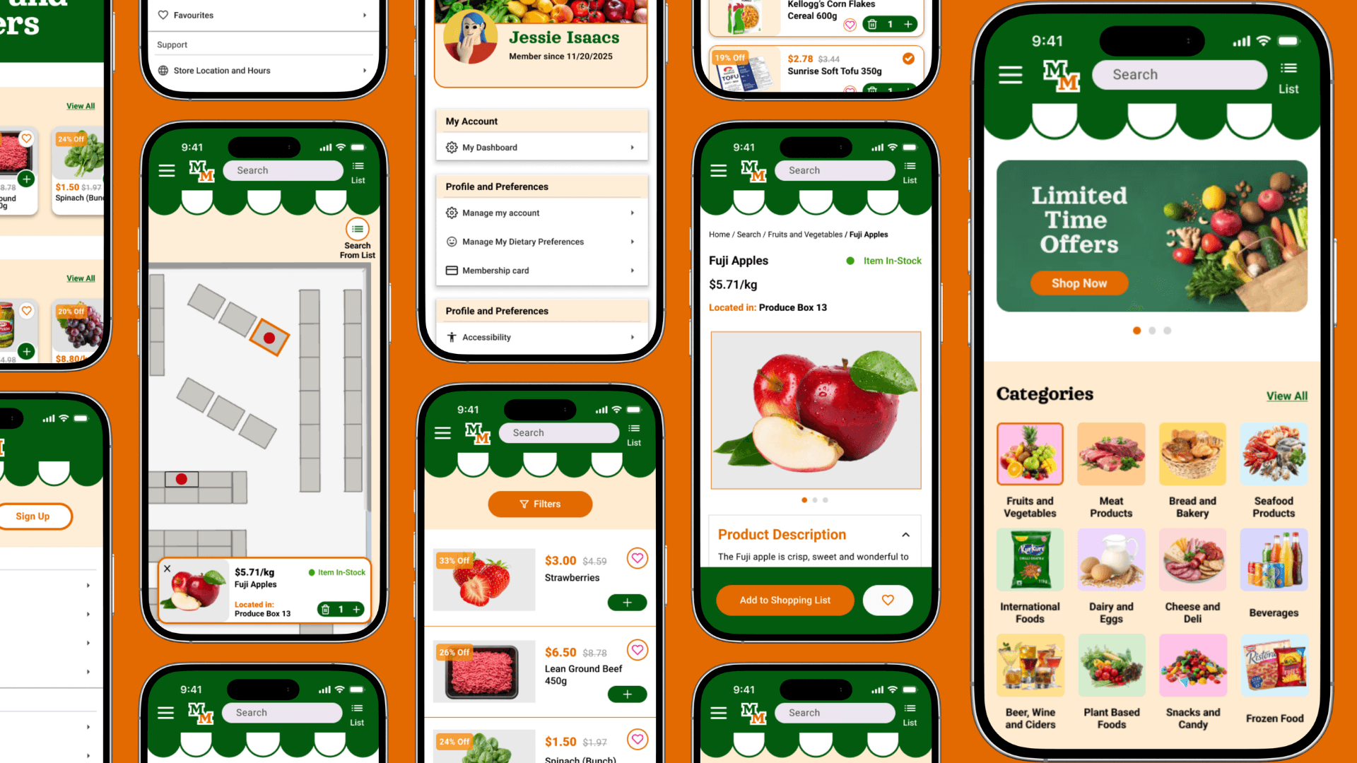
With the core functionality tested and refined through several iterations, I incorporated styling and colour to bring my high-fidelity application to life, trying to mimic actual functionality as closely as possible.
THE RESPONSIVE WEBSITE
Moving from a mobile-first approach into a responsive website.
The initial design approach for this project was mobile-first, mainly due to course instructions but also because the natural use case of a grocery store companion leans nicely into a mobile interface. Adapting this design onto a responsive website came with some challenges due to some fundamental differences between the two formats such as screen sizes and the browser.
My goal was to take the mobile application and try to replicate the features as closely as possible, focusing more on feature parity rather than structural similarity. This approach mostly worked great but some features such as the live in-store navigation could not be transported over 1 to 1.
I followed the same process as the mobile application, from paper wireframes to high fidelity after multiple rounds of feedback and iteration.
FINAL DESIGNS


TAKEAWAYS!
What I learned and what I would do differently:
This was my first full-scale, self-taught UI/UX project, and I was able to learn in depth about the entire design process from start to finish. I learned the of experimenting early and trying out different approaches before settling on a design pattern, while also gaining a deep understanding of usability testing and integrating feedback into prototypes.
Although this was a fictional project that was not pushed to production, if I were to revisit this later, I would take steps to improve this design further. Some key refinements I would make are:
Improve accessibility compliance by creating alternate interfaces with alt text instead of images for compatibility with screen readers.
Improve the in-store navigation page by creating a high-fidelity version of the in-store map, so it looks closer to the final product.
Obtain feedback from more experienced UI/UX designers to improve my design process.