
Epic Games Launcher Redesign
UX Design
UI Design
UX Research
ROLE
DELIVERABLES
Desktop App
TIMELINE
March - April 2026
CONTEXT
Refreshing the design of the Epic Games Launcher to enable users to buy and play the games they want faster.
In December 2018, Epic Games launched the Epic Games Launcher to compete with digital distribution giants like Steam. Despite launching much later than Steam, Epic Games lacks many of the features that Steam or other game distributors are known for. Even basic features, such as reviews, are abstracted and unclear to users when browsing games.
USER RESEARCH
To create an application that enriches user's lives, we need to know what they need.
In addition to my own experiences using the Epic Games Launcher, I conducted user research through secondary sources such as forum posts. I wanted to obtain candid feedback about how users felt when using the launcher day-to-day, what they like, and what they would like changed. Users generally were unhappy with the interface, and many shared their grievances through dedicated posts:



Posts complaining about Epic Games' UI have been made for years, with some as recent as 2 months ago.
I was able to distil the information gained from forum posts into four pain points that best represented the outdated storefront:
The challenge was to transform the current user experience with the launcher into an experience that is more informative and intuitive for users.
DESIGN PRINCIPLES AND SYSTEMS
Creating a focused redesign by following specific goals.
The Epic Games Store aims to provide a simple interface for users to discover, buy and manage games. To ensure the redesign preserves that original vision while resolving the issues identified earlier, I focused on the following core values.
Simplicity
All features and user flows should be designed to minimize complexity and maximize intuitiveness.
Transparency
Users should have access to personal and public metrics to inform their decisions on the platform.
Consistency
The design language, such as the sizing and layout of different elements, should be consistent and predictable.
As the redesign was functionally substantially different from the original launcher interface, I preserved the original colours and fonts to help existing users acclimate through familiarity.

Some of the design system elements used while redesigning the Epic Games Launcher.
GROWING PAINS: STOREFRONT
The Storefront
The existing storefront is too cluttered from conflicting components that do not mesh well together. This increases complexity by making it awkward to navigate, while allowing for less detail due to mismanagement of space.
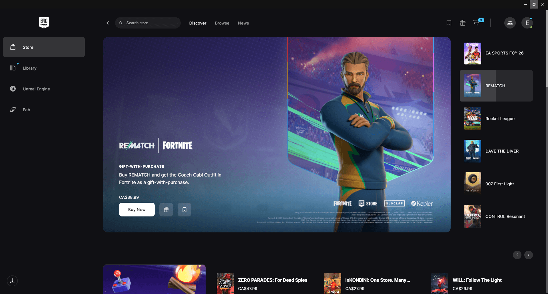


The current Epic Games Launcher storefront.
Pinpointed Issues:
The current navigation sidebar takes up substantial space but offers very little value.
The carousel provides very little information about each game.
Inconsistent sizing and layering for different groupings of games.
There is a lack of clarity on sale durations and adding games to wish lists.
The Redesign:
My main goal with the storefront redesign was to improve element sizing so we can use the viewpoint to display more information. By grouping similar elements and establishing consistent sizing, I was able to add more elements without creating a sense of clutter. This reduces friction by streamlining the placement of UI elements and giving the user more power to make informed choices.

The redesigned launcher storefront.
Repositioned and reorganized the main and sub navigation layout to help guide user flows and choices.
The game carousel now displays rating, tags, and images of gameplay.
Added consistent sizing and design to curated game lists, which now also display sale duration and a visible wishlist button.
GROWING PAINS: GAME DETAILS
The Game Details Page
The game details page on the Epic Games Launcher suffers from unintuitive layouts and unnecessary friction for users who are looking to learn more about a specific game. By improving the layout to add the most relevant information to the forefront, we can better organize the page and improve user follow-through.
The current user experience of viewing a game's details on the launcher.
Pinpointed Issues:
Core game details are stored in a sidebar that clips below the fold for standard desktop screen sizes, making it awkward to quickly review basic details.
Game details not placed on the sidebar can be easily missed while scrolling through the sidebar.
The review section is vague, with little clarity on how scores were determined. Also impossible to view individual user reviews.
Add-ons are difficult to parse and take up too much space on the screen.
The Redesign:
To make browsing the details page intuitive, I organized the page layout using a top-to-bottom approach where users can parse different components sequentially without missing anything. Removing the sidebar on the left also allowed me to give more detail near the top, so that users can quickly parse the most important information about any given game without needing to scroll at all.
The redesigned launcher storefront.
Aggregated all game details to the hero to make it easier to parse without needing to scroll down to see everything about a game.
Simplified add-on section by streamlining and compacting all the information.
Created a sidebar with game features, achievements, supported languages, and individual user reviews for easy access.
GROWING PAINS: USER PROFILE
The Profile Page
The existing profile page contains very little information about the user, and gives the impression that it was created as an afterthought. This page needs to be expanded upon to give a bird's-eye view of the user and their experience on the application.
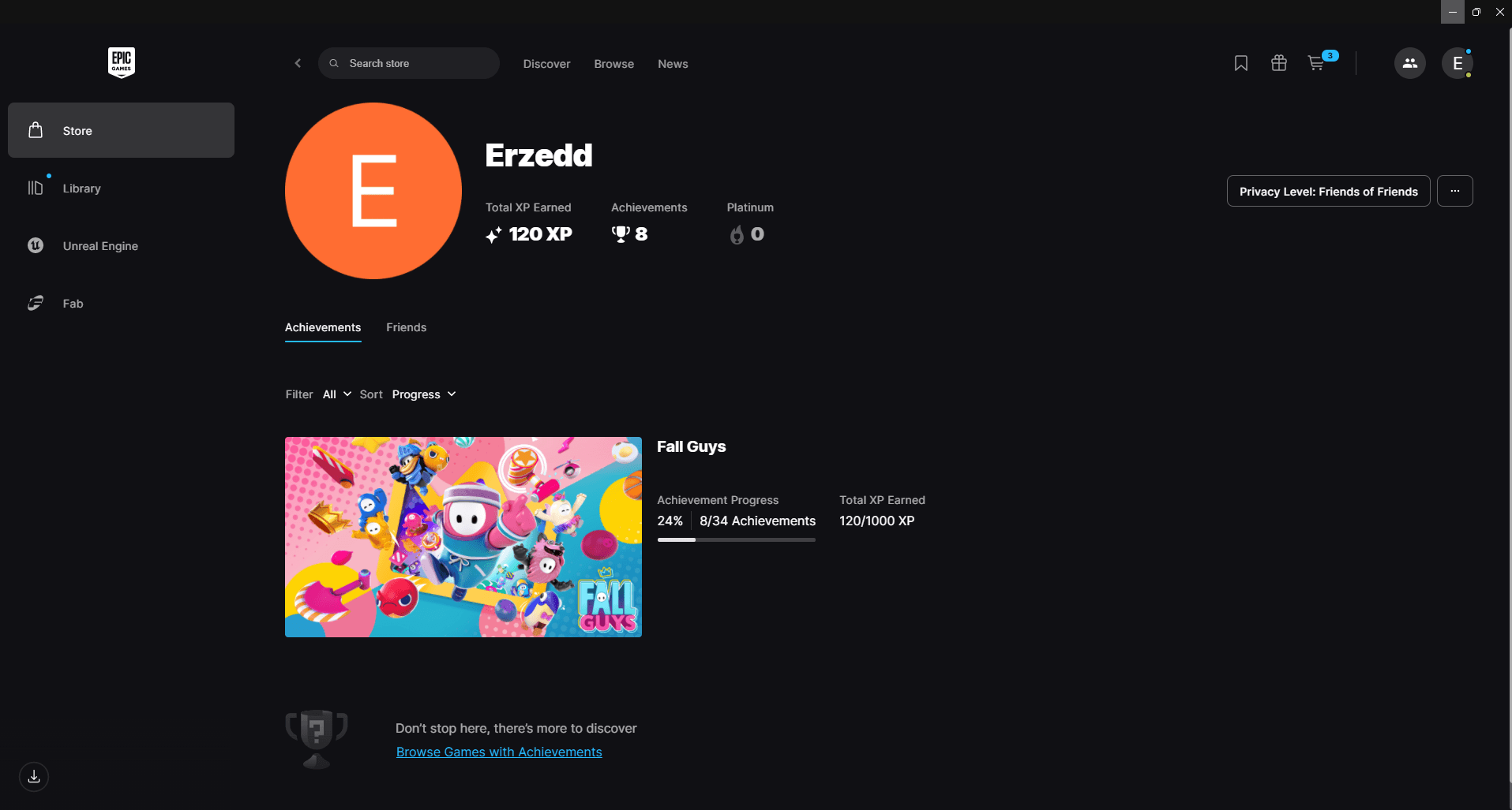
The current barren user profile page.
Pinpointed Issues:
Does not display owned games, recently played games, and hours played.
Does not display online status or allow users to input a biography section.
The XP feature was intended to be tied to the user level but was never developed.
The Redesign:
Incorporating more details about how the user interacts with the system on their profile creates a more personalized view that users would want to share with others. It also creates a positive feedback loop where the more users interact with the system, the more progress they earn on their profile.

The redesigned user profile page.
Added a “recently played” section to highlight games users have been engaging with recently.
The recently played section now shows hours played, achievements collected, xp earned, and the 4 most recent achievements acquired.
Added a bio section and a modifiable user status dropdown.
Added a reviews section for the user to look at previous reviews they have made.
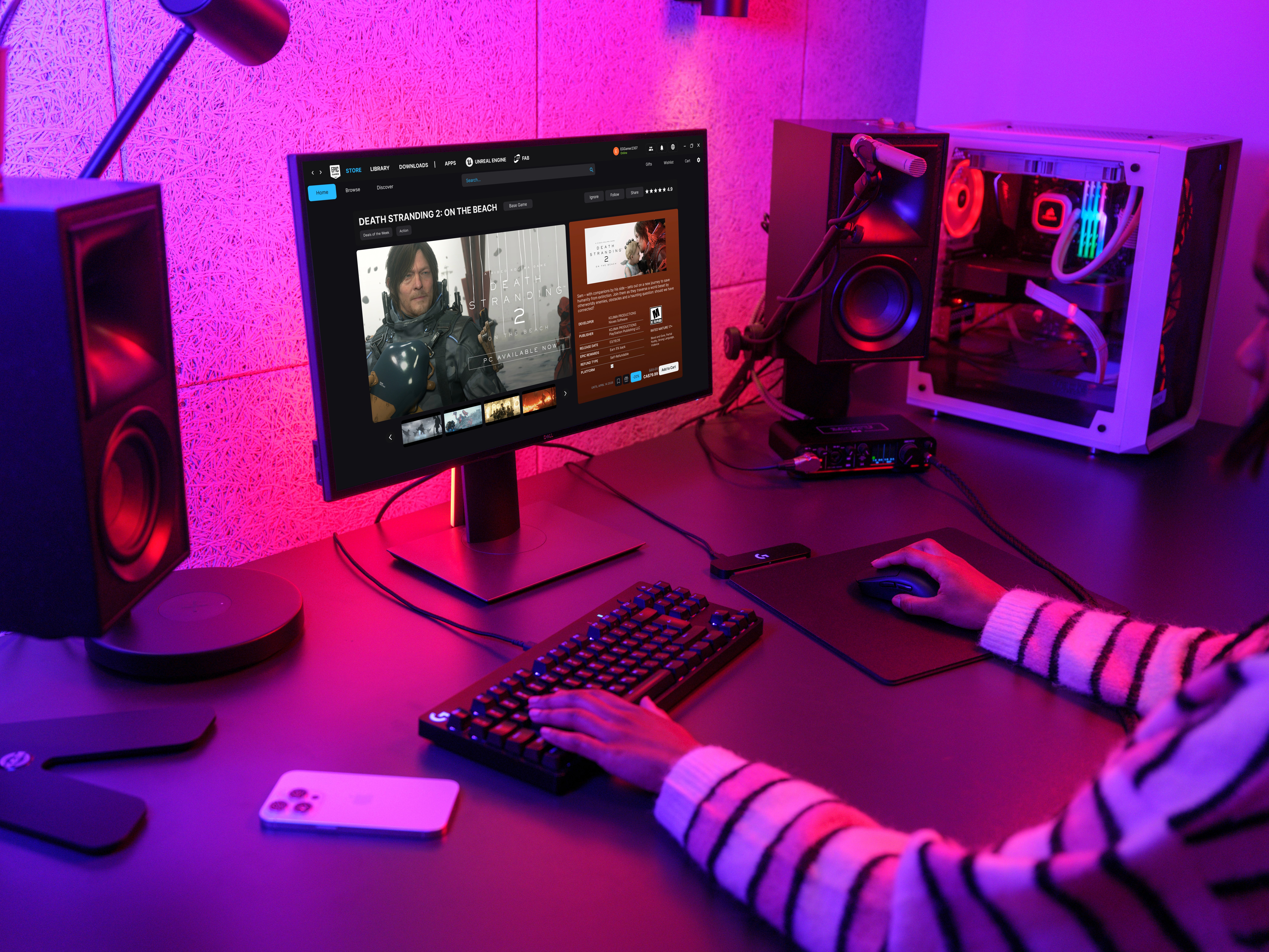
FINAL DESIGNS


TAKEAWAYS!
What I learned and what I would do differently:
As this was a personal project not deployed to production, there are no KPIs that can be used to measure the success of this redesign. If this redesign were to be deployed to production, success could be measured through the following metrics:
Retention rate: How often users are returning to the platform after using it for the first time.
Follow-through: How often are users purchasing projects relative to viewing them.
Engagement: Frequency at which users are participating in reviews.
Task Time: How long does it take for a user to complete the purchase process.
However, some current takeaways I have obtained during this project are:
Frictionless navigation
Consistent page layouts and predictable user flows drive engagement by reducing barriers to entry. Users should be familiar with navigating the platform even if it is their first time using it.
Quick View
By having the core information about each game viewable at a single glance, users are able to evaluate what games they would like to purchase faster, driving engagement and follow-through.
Personalization
Revamping the profile to log the user's experience allows them to display their accomplishments and provides a reward beyond purchasing and playing games.
Community
Having access to individual user reviews creates a sense of community and helps users find games that they are likely to enjoy, driving user satisfaction.